Cincinnati Public Radio Show Brands

The Problem: Cincinnati Public Radio (CPR) needed distinct, engaging branding for three shows—Looking Up, Backed Up, and Community Dispatch—that would stand out in a crowded podcast landscape while aligning with NPR’s identity. Each show required a unique look that balanced individuality and network cohesion.
The Solution: I crafted bold, eye-catching branding using colorful, vector illustration to create cohesive yet distinct visual identities.
Looking Up – A modern, playful design capturing space exploration.
Backed Up – Retro 70s aesthetics and bold colors bring energy.
Community Dispatch – Speech bubbles & icons amplify storytelling.
These designs elevate CPR’s programming, entice listeners, and establish lasting brand recognition.
Key Roles & Skills:
→ Concept Sketching
→ Custom Typography
→ Illustration
→ Poster & Promotional Design
Looking Up
About the Show:
Looking Up with Dean Regas is a lively podcast hosted by Cincinnati Observatory’s Dean Regas. The show takes listeners on a fun and engaging journey through the latest astronomical discoveries, presented in a quick-paced, accessible format.
Design Challenge:
Create a logo that fits NPR’s podcast style, incorporates the show title and Cincinnati Public Radio logo, and represents Dean Regas with a pictorial element.
Solution:
I created a design that captures Dean in a relaxed, upward gaze, lying on a hillside and pointing toward the night sky. The background features a clear, star-filled sky with shooting stars adding a sense of motion.
The title, “Looking Up,” is cleverly integrated into the scene, formed by stars connected to resemble a constellation, directly tying into the theme of space exploration and wonder. This design choice not only aligns with NPR’s visual style but also brings the podcast's exploratory and awe-inspiring nature to life in a dynamic, visually striking way.

Looking Up Branding on NPR Website

Looking Up Branding on Spotify Library

Looking Up Branding on Apple Podcasts

Looking Up Brandmark on Episode Feature Thumbnails

Looking Up Branding on Cincinnati Public Radio Site

Looking Up Branding on Spotify
Concept Sketches

Backed Up
About the Show:
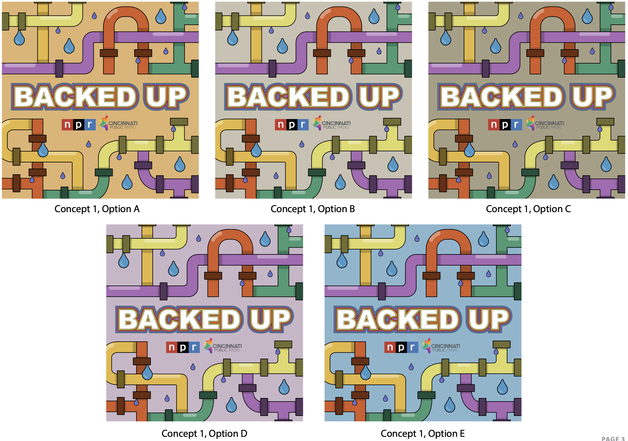
Backed Up dives into Cincinnati’s crumbling plumbing infrastructure, uncovering the mysteries behind the city’s sewer problems and their social and environmental impact.
Design Challenge:
Create a visually striking logo that brings color and life to a gray and brown topic, while staying true to NPR's podcast aesthetics. The logo should have a retro 70s feel and incorporate the show title and both the CPR and NPR logos.
Solution:
I designed a vibrant, retro-inspired logo with bold typography and colorful pipes that represent the labyrinthine nature of Cincinnati’s plumbing system. The playful use of color and leaky pipes highlights the complexity of the issue, giving the show a unique and memorable identity that stands out in a crowded lineup.

Backed Up LIVE Community Event

Backed Up LIVE Community Event

Backed Up Branding on Spotify Library

Backed Up Branding on NPR Website

Article about the Backed Up podcast on Cincinnati Public Radio Site

Banner ad for Backed Up
Concept Sketches

Digital Concept Drafts


Color Exploration

Show Title & Font Exploration

Community Dispatch

About the Show:
Community Dispatch brings attention to the voices and stories from various communities, diving into their experiences, concerns, and joys through long-form narrative journalism.
Design Challenge:
Create a logo that emphasizes community, fosters understanding, and feels connected to the show’s deep dive into the lives of the people it covers. The design should align with NPR’s style while highlighting the show's conversational and journalistic approach.
Solution:
I designed a logo with a central speech bubble emerging from a radio microphone, symbolizing conversation and connection. Surrounding it are smaller speech bubbles with icons representing community and diverse topics. The vibrant, illustration-based approach reinforces the show’s commitment to dialogue and storytelling, making the logo both engaging and memorable.

